Introducing the Book Navigator

Browsing a digital book is not nearly as nice as leafing through a paper book. That’s why we’re developing the Book Navigator.
Inspired by subway signs, videogame minimaps and YouTube’s segmented progress bar, the Book Navigator aims to make jumping through digital books easier, more useful and more fun. It’s Immer’s non-linear book browsing tool, our reading GPS, our Table of Contents 2.0!
We recently shipped an improved version of the Book Navigator, high time to properly introduce it to you.
Modes of reading
To start with, some background from our research. Reading is not just one thing, it’s a collection of advanced neuro-acrobatics (I’m paraphrasing research like this Dutch meta-analysis) in which you continually switch between mental modes.
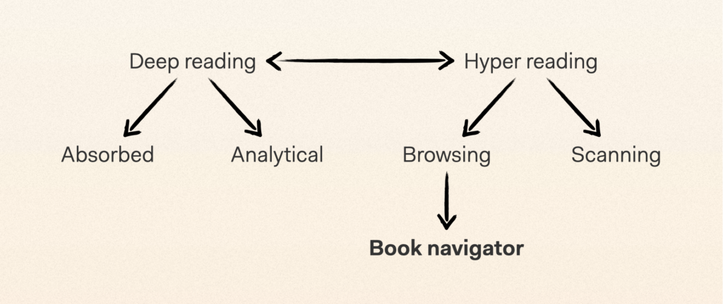
When processing a piece of writing linearly, you go between ‘absorbed’ and ‘analytical’ forms of ‘deep’ reading. You dive in, decipher text, then bounce back to reflect on the information you just collected. Do you understand what you just read? Do you believe it? Does it make you feel a certain way?
Then there’s the distinction between ‘deep’ and ‘hyper’ reading. As mentioned, the ‘absorbed’ and ‘analytical’ modes are both forms of deep reading, where you process text closely, while hyper reading is more about skimming, scanning and browsing. Perhaps because you’re looking for a specific piece of information, or because you’re not yet sure if you want to invest in deep reading the book you’re holding.
During the first years at Immer we focused on absorbed deep reading, which seemed like the biggest challenge we had to tackle. Because, in the attention-hostile environment of the smartphone, how do you get people to focus on a single text over long stretches of time? This led to the invention of portions (text chunks of varying length), the vertically oriented flow and the progress ring (that lets you toggle more elaborate reading controls), and experiments with relaxing colors, animations and even audio.
The effort started paying off, as early readers reported being (true to our company name) more immersed and had a deeper appreciation of what they were reading. But understandably, people asked us about ‘the other stuff’ too. For example, they wanted to reflect on what they’d read by taking notes, and they wanted to quickly browse a book, or even jump across it non-linearly.
So we started building upon our solutions for absorbed deep reading to facilitate analytical deep reading and hyper reading. We worked on a better way to take notes, automatically generated summaries… and the Book Navigator project was brought into life.
Immer primitives
As our text portions were oriented vertically and smartphone screens offer more vertical space than horizontal space, it made sense to have a vertical Book Navigator too.
In a way, it would just be a better table of contents (also a vertical concept), but building on scientific ideas about embodied and spatial cognition, we thought we could go further. For example, by including a sense of how the contents are structured, and how big each piece of content is.
Traditional e-books hide a lot of that kind of information to the reader, and sometimes (because not all ePub files are created equally) even lack any ToC at all. Here, we would be able to play to our strength at Immer. Because we’re dividing books into portions, with visually enhanced chapter and part transitions, we already have to understand how books are structured. Now we could use the same data to better display a book overview.
E-books don’t make it very easy and nice to flip through them either, certainly not as much as a paper book does. On top of that, it’s easy to lose your position, making your reading experience feel less stable. Could we make something that was, all at once, more robust, richer in information, more ‘digital-native’ and more playful?
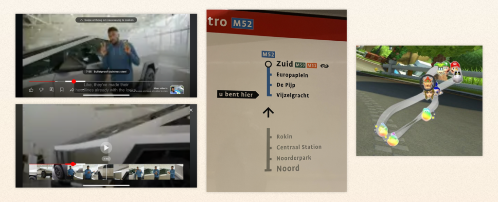
We took inspiration from obvious things like the way you browse through a big photo collection on your phone or a long YouTube video with different sections, but also from the Amsterdam metro signage, and video game minimaps.
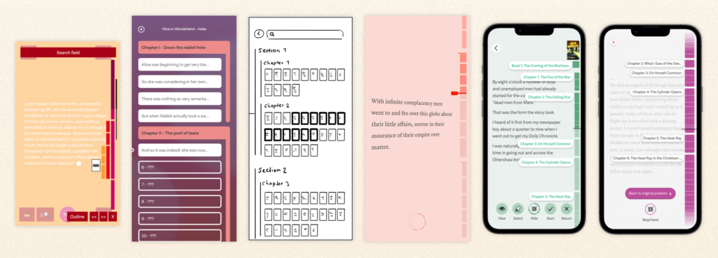
Based on the above ideas (and others), we made a ton of sketches – that got way too complex very fast, and then were only slowly whittled down to their essence. We made prototypes, and more sketches, and then more prototypes, each iteration leading to better results.
Out in the wild
Last October we actually shipped a first version of the Book Navigator in Club Lees, the social reading app that we launched with VPRO, the Dutch public broadcaster, and digital agency IN10. This meant that people could start using it in the wild, and provide helpful feedback.
Here’s what it looked like:
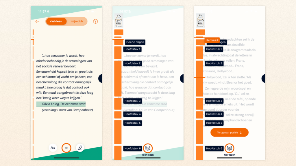
After opening the reading controls (with the progress ring menu button), you first saw a thin version of the Book Navigator, as well as your position within the book and current chapter.
If you tapped the thin Book Navigator, it expanded. You could then scroll through the whole book and see all of its parts and chapters. A few design details of note:
- Title pages of book parts were wider than chapters so they ‘jumped out’ a little (like Goede dagen in the above screenshots).
- Chapters were visualized based on size, so for longer chapters, the blocks would be longer too. This helped you understand, in that embodied/spatial sense, the type of book you’re reading (many short chapters? Only a few long ones? Divided into 5 rigid parts?), as well as the chapter you’re in (is it a typical chapter? Is it almost over?).
You could also tap a part or chapter label, or tap within the chapter blocks, to navigate to that location. Once you did, you could choose to either go back to where you started (with the big button at the bottom or the ‘you are here’ label on the Book Navigator itself), or read from that point. Helping you be more aware of your position, and conscious of potentially leaving it.
Finally, there was a small book cover at the top to remind you what you were reading. This actually came up in user research a lot: When people are reflecting on what they’re reading, they like to peek at the (paper) book cover from time to time. So we made it possible digitally, too!
Issues and requests
As people tried the Book Navigator, and we lived with it ourselves, we collected some frequent issues and popular requests:
- It’s hard to get a sense of progress for the full book, as you have to scroll multiple screens to see it in its entirety.
- I’d like to be able to ‘scrub’, flipping from page to page, to find the specific location I’m looking for.
- I’d like to be able to take a closer look at the book cover.
- The labels of short chapters tend to overlap, which looks messy.
- If my previous position is off-screen, and I ‘jump back’ to it, I do go to that position but it’s out of sight.
- On the housekeeping side of things, the first Book Navigator wasn’t as responsive as we’d like, and not as configurable. We wanted the next version to be much smoother and we wanted future customers to be able to toggle things like screen side (even offering it as an option to their readers).
New and improved
Earlier this year, we took the above feedback and started making improvements. The new Book Navigator is much snappier and more tactile, and looks like this:
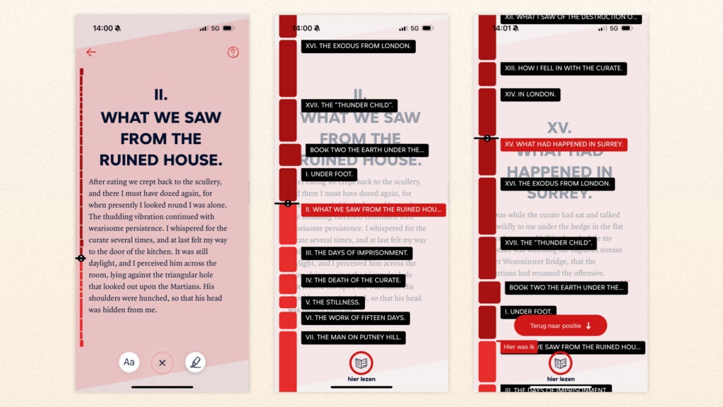
The Book Navigator now starts out in a zoomed-out mode within the reading controls, showing your progress in the whole book at a glance. Tap it to open the normal Book Navigator, which works mostly as before. You can scroll through it, or tap anywhere to jump.
However, the position indicator is now a slider, meaning that you can drag it to ‘scrub’ through the book. In the ‘big’ (zoomed-in) BN, this lets you navigate to precisely the page/portion you want, while in the ‘small’ (zoomed-out) BN it navigates between chapters. We also added haptics, recreating the sensation of pages flipping under your finger in a digital way.
Some smaller changes:
- We now use darker and lighter tints in the chapter/part blocks to make your current position even clearer – this only changes once you actively choose to read at your new position.
- If a chapter is smaller than a chapter label, there will now be a gap instead of labels overlapping.
- Going back to your old position outside the current screen? We now transport you there with a nice animation.
- Drag down at the top, and you zoom in on the book cover.
Try it yourself
If you want to try this latest version yourself, it’s now live in the (Dutch) Club Lees app. You can download the app and make an account for free (if you can navigate the Dutch interface). Give it a spin and let me know what you think!
You can also wait for an Immer-powered reading app to pop up near you. Or get in touch if you want to make something like that happen yourself by licensing our Immer Reading System.
What’s next?
While we’re pretty happy with the Book Navigator in its current form, there are many things, big and small, that we’d still like to do with it.
For one, building ‘search within the book’ on top of the Book Navigator would be a big and obvious step. And besides chapters and parts, we want to try using it to visualize paragraphs and sub-chapters, as well as image and footnote locations, or even social comments. Finally, for now, we’re thinking about how we could make the Book Navigator easier to reach. Just swipe from the side to get it? We don’t want there to be too many hidden and potentially distracting surprises during your absorbed deep reading though…
Your feedback will be very useful to help us prioritize, so again, let us know what you think. In the meantime, enjoy your reading!
Niels ’t Hooft
Co-founder & CEO Immer